Data is so important when it comes to how you run your business. If you’re regularly looking at data through a landscape business report, then you’re likely making major decisions based on what you read.
But what you see is also so important. In fact, one might argue that seeing is understanding.
What we’re talking about is visual reporting. Perusing data is not going to immediately give you conclusive answers that you’re looking for.
It can take hours of reviewing and manipulating that data to get the answers that you want and in today’s fast-paced world, that isn’t always the ideal scenario. This is where visual reporting comes into play.
Visualization can help you (and your team) comprehend data quickly and make fast-but-educated decisions.
What Exactly is Visual Reporting?
Visual reporting is what happens when you take data and you put it into an easily viewable form such as a graph or a chart. Data visualization is an important part of business as it allows business owners and managers to make actionable decisions based on that data.
In other words, looking at a bunch of numbers can be tedious and time-consuming. Today’s business owners not only want to produce good data, but they also want tools to be able to put that data into a visual form so they can see it and make important decisions.
Greater Understanding at Your Landscaping Business Comes with Visual Reporting
Let’s delve deeper into why your business might benefit from a visual report as opposed to just a data-driven landscape business report.
Ease of use (or ease of understanding) is probably the biggest benefit of all. It’s just much easier for everyone in your business to look at a chart of graph than it is a series of numbers.
Of course, it’s important not just to look at the “good,” but the “bad,” too. For instance, are you over budget? With visual reporting, you can see this very quickly and easily by designating a certain color that pops out on something like a pie chart or a bar graph.
Visual reporting also gives owners and managers a really easy way to interpret how the company is performing as a whole. They can look at what is in the projected pipeline and what current sales numbers look like—and this simplifies forecasting. You can make an assessment quite easily (and quickly) with a visual report on exactly where things stand.
It’s What You Do Next That Counts
Of course, it’s important to note that while making the data easier to visualize and understand can make decision making easier, it’s not going to make those decisions for you. It’s what you do with the data that counts. What you do next is what is going to help grow your business and make you more profitable by eliminating problem areas and making valuable changes.Let’s look at some examples where visual reporting made profitable changes. These are real-life examples from actual Asset users.
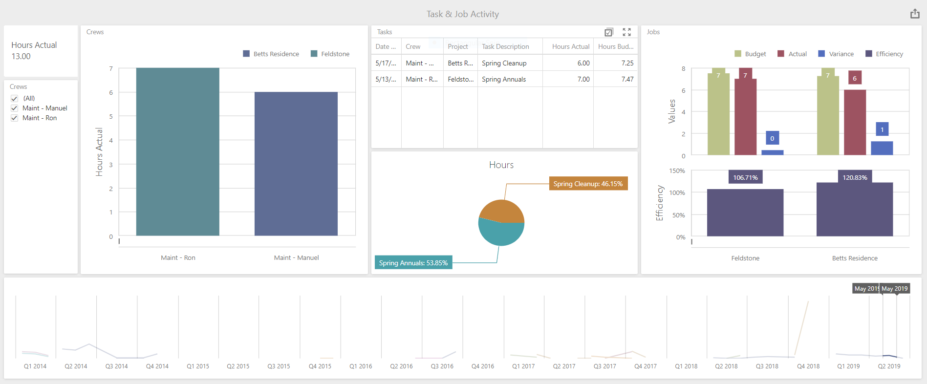
Crew Inefficiencies
On a visual report, you would be able to see what are the budgeted hours and the actual hours in an easy-to-view format. For one particular company, those hours were continually coming in the red on a certain route. So, the company put a different crew on that route.

When new data came in, the crew (that was new to that route) came in the “green” with data showing they were under budget. However, the crew that was previously working that route and put on a new one, came in the “red” once again. This made it clear that it was a problem with inefficiencies with that particular crew leader and crew—not the route. It allowed the company to make important changes to get them back on track.
Moving Away from Non-Profitable Clients
With visual reporting, the red flags will scream out to you that you’re going to be over budget on hours or materials (or both). This might not have been easy-to-recognize information prior to having landscape business software. For that reason, more than one client has told us that visual reporting has also lead them to let clients go because they’ve realized they are not profitable.
After having gone back and drilling down into the information on the visual report, it might become obvious that your mark-ups are way off or even what you’re charging for labor will have to be raised. Sometimes that means having to tell clients you’ll need to charge more or let them go. After all, you have to be profitable.
Spotlighting High-Value Clients
Another benefit of visual reporting is the ability to measure contracts’ “value.” But you not only want to look at your largest revenue-generating clients in terms of what you’ve sold them but also what referral work you’ve gotten from them.
You can then rank clients based on work performed for them plus referrals given in order to have a strong sense of your top people. That will allow your sales staff to go the extra mile of those clients, really making sure that they keep them happy.
The Best Visual Reporting Tool for Your Landscaping Business
A lot of companies use Excel spreadsheets as a form of visual reporting. They take all the data that they have compiled and want to use for something like a landscaping monthly report, and then export it into Excel in order to create a visual representation of that information.
While Excel is probably the most commonly used tool for visual reporting, it’s not necessarily the best tool. For one, it is prone to errors, largely because of “human error” and mistakes made when entering the data. Because of this, many landscaping business owners have been looking for a better alternative.
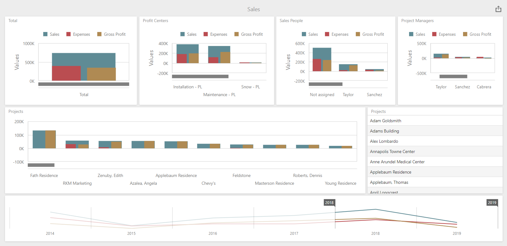
The future of data analysis is in dashboards. A dashboard is a data management tool that visually tracks, analyzes, and displays key data points that your business is collecting. For landscape business owners, this type of visual reporting can be a gamechanger.
While there are different dashboard tools on the market, if you’re an Asset user, connecting to a third-party visual reporting tool is going to be more work than it’s worth—particularly now that Include Software has introduced its own analytics dashboard for your landscaping business.
Introducing iKPI
The introduction of iKPI (Include Key Performance Indicator) is a visual analytics tool that will help our users to derive value that is tied up in their data and turn it into usable information. While other dashboards are limited to production-only data (or solely to accounting functions), iKPI fuses together data from every area in which you are utilizing Asset to collect data—CRM, accounting, production, sales, and more. As a result, iKPI can help provide you with comprehensive insights into how your business is performing across all facets.
The best part of introducing this analytics tool into your business is that there is no learning curve. Those who subscribe to iKPI to use with Asset only have to log in and the product will put everything in front of you, in a visual format that’s easy to read. It does all of the work of taking a mountain-load of data and processing it into something easy to see and utilize.
This is a gamechanger. While the data being produced from Asset was already helping our users to make better decisions—now you’ll be able to make them easier and faster.
With the support of this visual reporting tool, you’ll truly have all of the data at your fingertips, ready to use. That should put your business on the path to better performance and increased profitability. Your team will be able to work smarter, not harder, and that’s a win for everyone.
If you’re ready to see how landscape business software with a visual reporting tool can make your business stronger, let’s explore and see what our products can do for you.